Performance Growth
How to Optimize Your Amazon Main Image: 3 Tips for Higher Conversions

1. The main image is not taking up enough space
Problem: Many product images fail to utilize the available digital shelf space effectively, making the product appear small and unimportant.
 Tip: Get creative in maximizing your digital shelf space. Make sure your product fills the image frame as much as possible without compromising on clarity or quality.
2. The main image appears flat
Problem: Flat images lack depth and dimension, making them less appealing and engaging to potential customers.
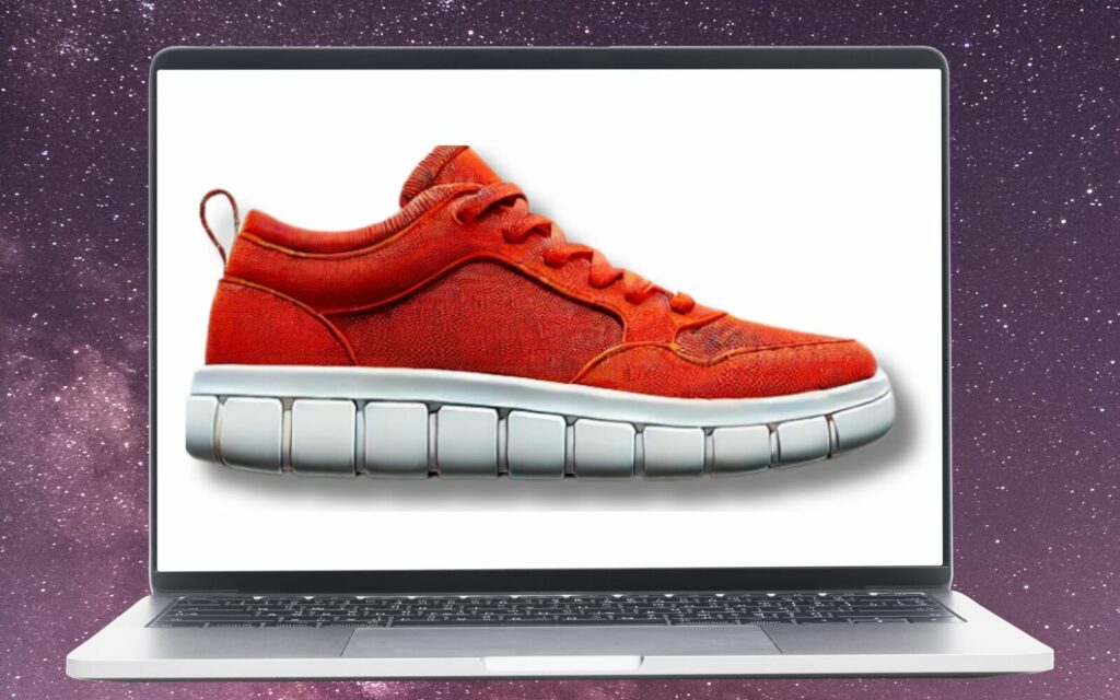
Tip: Add depth to make it look like it’s about to pop off the webpage. Consider using shadows, reflections, or a slight tilt to give your product more dimension and make it stand out.
3. Too many shadows make the product appear poorly on the digital shelf
Problem: Excessive shadows can obscure details and make your product look unprofessional or unappealing.
Tip: Consider a 3D-rendered image for more appeal. A 3D rendering can eliminate unwanted shadows and provide a cleaner, more polished look that highlights your product’s features.
A 3D-rendered image can be a game-changer. It allows you to control every aspect of the lighting and angles, ensuring that your product is shown in the best possible light—literally. This technique can eliminate harsh shadows and highlight the product’s textures and finishes. Think of it as giving your product a professional photo shoot, where every detail is meticulously crafted to perfection.
What are the Amazon Main Image Requirements?
Amazon has specific guidelines to ensure that main images meet quality standards and provide a consistent shopping experience for customers. Below is a list of the key requirements you must follow to ensure your main product image complies with Amazon’s standards:
- Accurate Representation: The image must accurately show the product being sold, without placeholders or misleading visuals.
- White Background: The background must be pure white (RGB 255, 255, 255) to maintain consistency across search and product detail pages.
- Product Fills 85% of the Frame: The product should occupy at least 85% of the image space, ensuring it’s clearly visible and prominent.
- No Additional Graphics: The main image cannot include text, logos, borders, watermarks, color blocks, or other added elements that aren’t part of the product.
- Product Only, No Packaging: The product should be shown outside of its packaging unless the packaging is a key feature, such as in gift sets.
- Full Product Displayed: The entire product must be visible in the frame, with no parts cropped or cut off.
- Single Unit Display: Only one unit of the product should be shown, unless the listing is for multipacks or assortments.
- No Accessories or Props: The image should not include accessories or props that are not included with the purchase.
- Specific to Certain Categories: For example, clothing must be shown on a model, while footwear should display a single shoe at a 45-degree angle.
For a more detailed breakdown of Amazon’s image guidelines, including category-specific rules, visit Amazon’s official guide.
And if you’re looking for a quick and easy way to create professional, brand-themed images for your Amazon ads, Amazon’s new AI image generation tool might be the perfect solution. It uses AI to automatically generate engaging product images, even if you don’t have access to a design team. This tool is especially helpful for Sponsored Brands and Sponsored Display campaigns, allowing you to create multiple variations to test which performs best.
Make Your Main Image Work for You
Your main image is your product’s first chance to grab attention—and a critical factor in conversion rates. A poorly optimized image can mean missed sales, no matter how strong your listing is. To stand out in a competitive marketplace, you need a tailored approach that addresses both visibility and performance.
If you need a fresh set of eyes to review your product images and provide valuable feedback, we offer a free Amazon advertising audit—available exclusively for brands with a monthly ad spend of $25k or more. We’ll uncover areas of improvement, from image optimization to ad strategy, ensuring your listings are set up for maximum conversion.
Sign up for your free audit today and start converting more clicks into sales.
LET’S DISCOVER WHAT’S POSSIBLE FOR YOUR BRAND
We’re here to listen and uncover opportunities tailored to your unique goals.
Fill out the form to get started, and you’ll walk away with real insights and actionable recommendations—whether we work together or not.
- HANDS-ON LEADERSHIP
- AWARD-WINNING PARTNERSHIPS
- CUSTOM-BUILT SOLUTIONS


