Amazon Product Listing Optimization
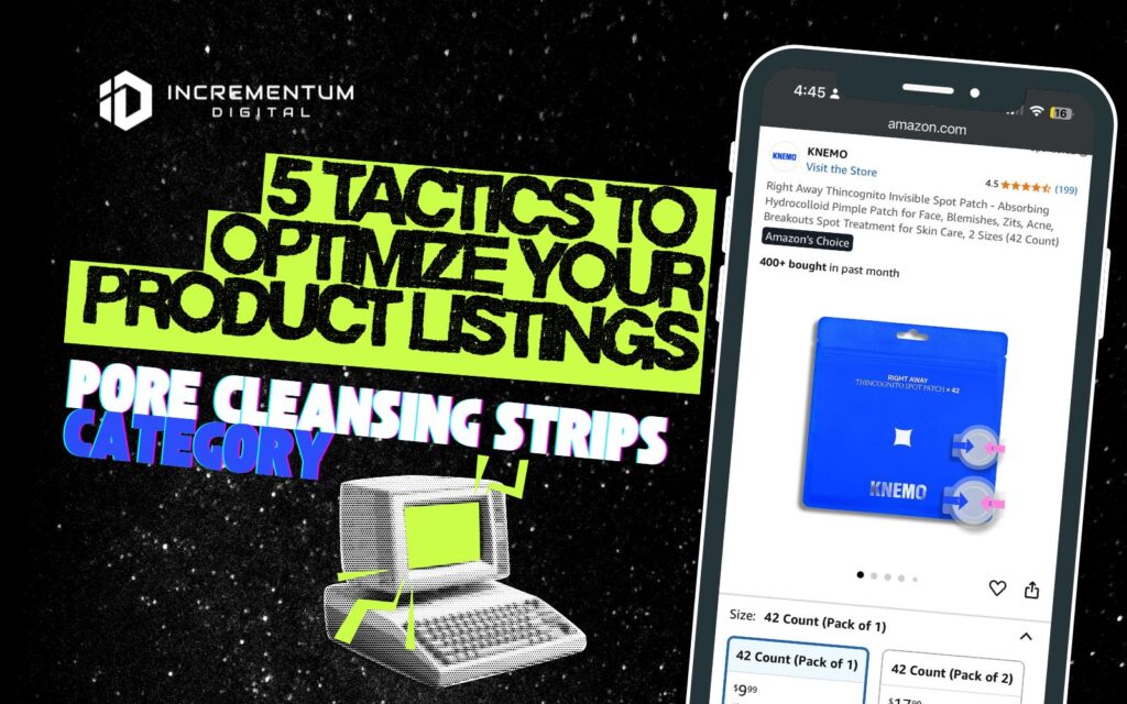
Top 5 Amazon Product Listing Optimization Tactics: KNEMO Right Away Thincognito Spot Patches
The acne patch category on Amazon has hundreds upon hundreds of listings. Search a core term and you get pages of near-identical dots. Brands like Mighty Patch™ dominate clicks and mindshare. That is why KNEMO is a useful model for challengers. In this breakdown, we point to the specific moves you can copy, and use these to plan your own optimization, lift CTR and CVR, and build a cleaner funnel from search to cart.

Learn How to Make Listings That Convert in 2025!
Read our step-by-step guide on how to optimize your listings using Rufus AI insights. Sign up for our newsletter and get your copy for free!
Show me how
Why We’re Spotlighting this Product Listing
KNEMO’s spot patches are a challenger in a crowded acne-patch category, but the listing shows real momentum and clean fundamentals, worth learning from even if it isn’t page one. The Keepa view here shows the Best Sellers Rank holding in the mid–five figures in Beauty & Personal Care, with long stretches of stability and periodic improvements (a sign of steady velocity, not one-off spikes).
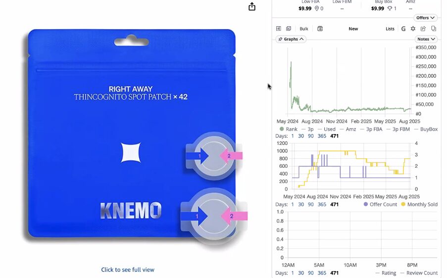
On the PDP it’s also #124 in Pore Cleansing Strips, which places it within striking distance of the subcategory’s front page. Offer count stays low and controlled, suggesting solid inventory discipline and brand ownership. In short: there’s proof of demand already, and with a few content and media upgrades, this ASIN has room to climb.
Now, let’s dive into their biggest wins:
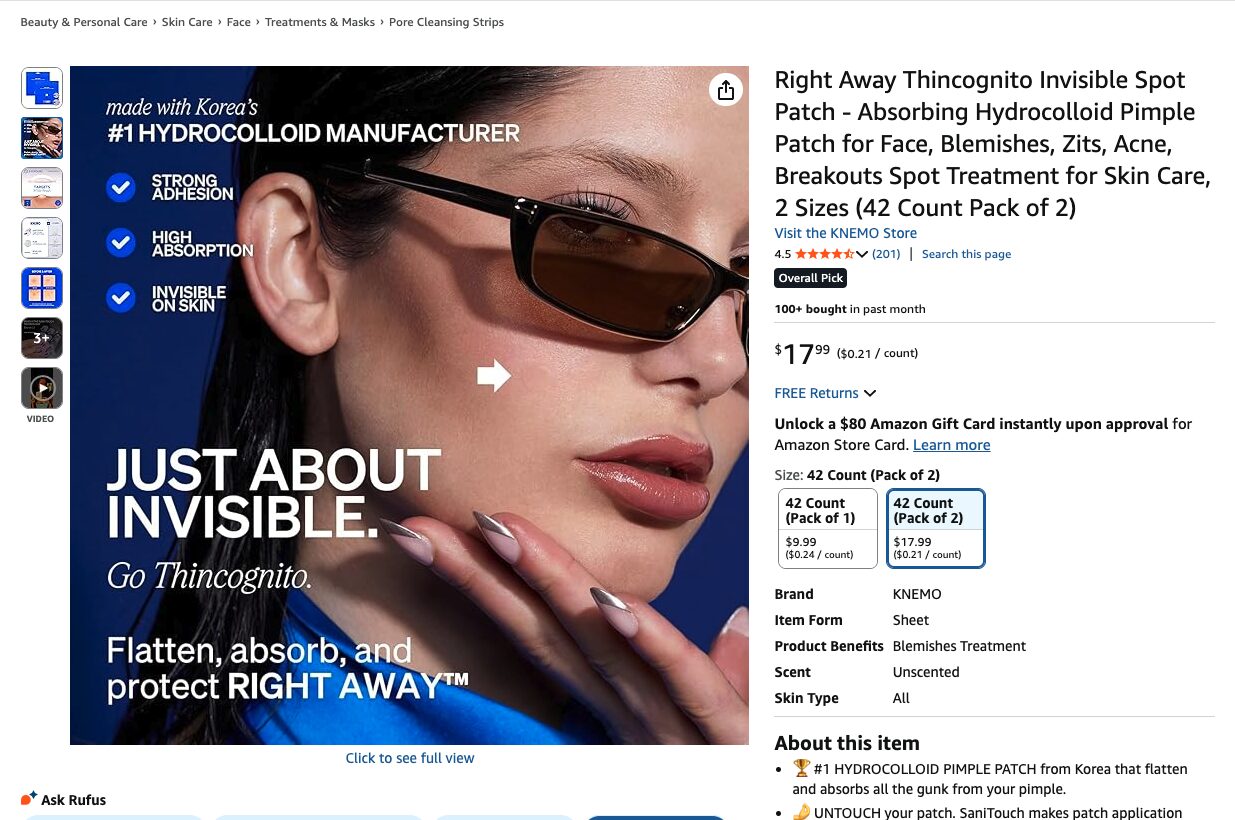
1. Their clinical visuals build trust on mobile
3. Their product video shows the mechanism and does the selling
The listing uses a tight, close-up demo that shows the patch being applied and removed in a few seconds. You can see the tab, the placement, and the finish on skin, so the promise of “touch-free” and “invisible” becomes concrete. That single clip answers one of the biggest questions in the category: How do I put it on without touching the spot?
This works because demonstration reduces uncertainty. Shoppers do not need to imagine the steps or the outcome; the video supplies it. Visual proof increases processing fluency and triggers the “I can do that” response that pushes people from interest to action. The first frame is arresting, the motion keeps attention, and the payoff shot delivers credibility. It is simple, quick, and persuasive, the right kind of video for a mobile PDP.
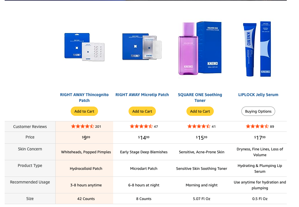
4. Their value is obvious at a glance


LET’S DISCOVER WHAT’S POSSIBLE FOR YOUR BRAND
We’re here to listen and uncover opportunities tailored to your unique goals.
Fill out the form to get started, and you’ll walk away with real insights and actionable recommendations—whether we work together or not.
- HANDS-ON LEADERSHIP
- AWARD-WINNING PARTNERSHIPS
- CUSTOM-BUILT SOLUTIONS