Retail Media
Why Packaging Redesign Matters: Heinz, Justin’s, and RxBar Before-and-After Success Stories
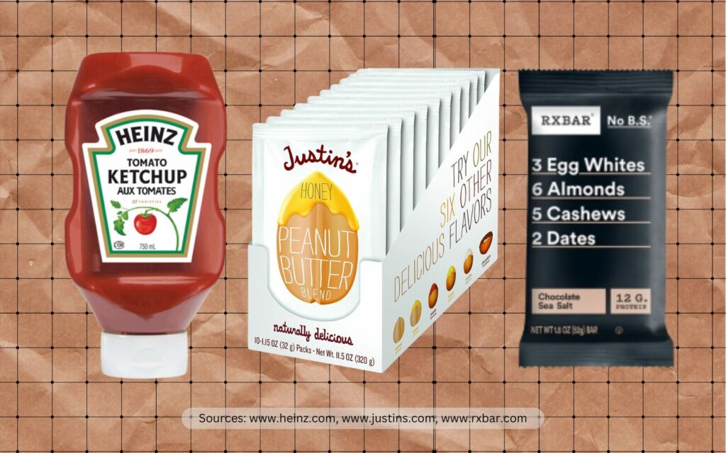
As the old saying goes, “Don’t judge a product by its packaging design.” But let’s be real—we all do! Especially when scrolling through Amazon at lightning speed, it’s often the main image that makes you pause and take notice. This is the irresistible allure of fantastic and functional packaging, like the ones the geniuses at Heinz, Justin’s Peanut Butter, and RxBar created.

Learn How to Make Listings That Convert in 2025!
Read our step-by-step guide on how to optimize your listings using Rufus AI insights. Sign up for our newsletter and get your copy for free!
Show me howIn this blog post, we’ll spotlight how these cases of successfully redesigned packaging catapulted sales to new heights. And if you scroll until the end, you’ll find our questionnaire that can help you determine if your packaging needs a redesign. Let’s dive in!
Packaging is often the first interaction consumers have with a product. It’s the silent handshake that can make or break a sale. A well-executed packaging redesign can dramatically influence consumer perception by making a product more appealing and aligned with current market trends. Let’s take a look at three prime examples:
Heinz: America’s Favorite Ketchup Bottle
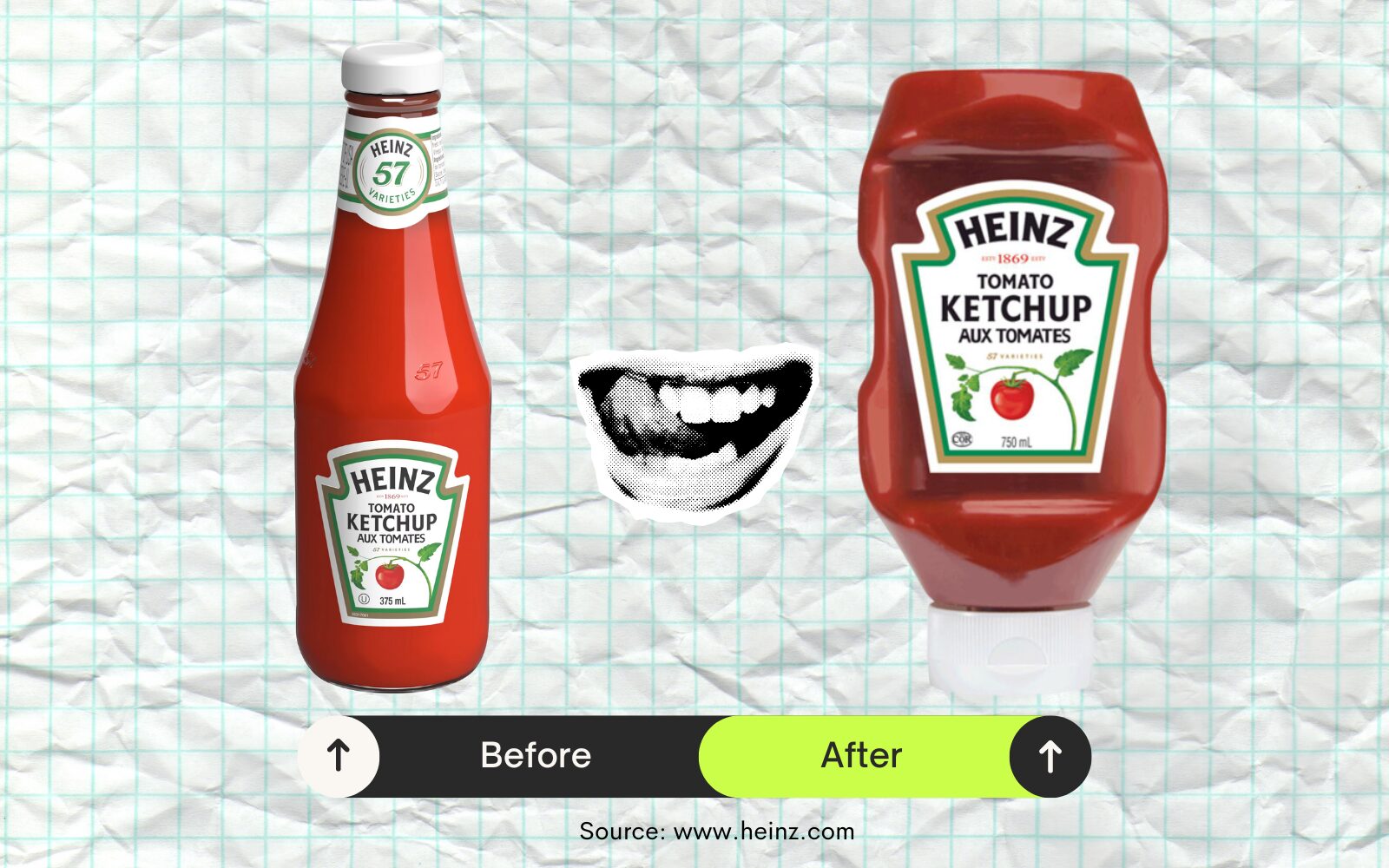
Heinz’s original glass ketchup bottle was a classic. But if you’re old enough to have tried getting ketchup out of it, you’ll know it was a pain to use. Getting ketchup out often felt like an upper-body workout, leaving many customers frustrated. Despite the brand’s iconic status, Heinz knew they had to tackle this messy issue to keep their fans happy and maintain their top spot in the market.
The Redesign: Squeezable Plastic Bottle
In 2002, Heinz introduced an upside-down squeezable plastic bottle with a clean stay cap. This new design addressed the dispensing problem, making it easier and more convenient for consumers to use. The bottle was designed with an ergonomic shape and a valve that allowed ketchup to be dispensed smoothly without the mess.
Results: Brand Perception and Market Position
The packaging redesign received the highest approval score for ketchup in Heinz’s history during consumer focus groups. The redesigned bottle became extremely popular, with a vast majority of Heinz’s ketchup now being sold in the upside-down format. The positive consumer response and increased convenience helped Heinz further boost its market share. In fact, Heinz has become the overwhelming choice for ketchup in the U.S., with 197.92 million Americans using the brand in 2020, solidifying its dominance in the market.
Lessons Learned from Heinz’s Experience
Justin’s Peanut Butter: The $281-Million Idea
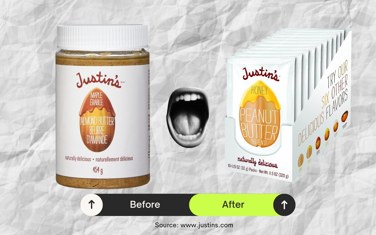
Initially, Justin’s Peanut Butter was sold in traditional jars. While the product quality was high, the brand struggled to differentiate itself in a crowded market dominated by established competitors. The bulky jars were not convenient for on-the-go consumers, which limited Justin’s reach among busy, health-conscious individuals.
The Redesign: Single-Serve Squeeze Packs
In a bid to address these challenges, Justin’s introduced the innovative squeeze pack. This single-serve packaging was designed for convenience, allowing customers to enjoy their peanut butter anywhere, without the need for utensils. The new packaging was also compact and portable, catering perfectly to the active lifestyles of its target market.
Results: Improvements in Consumer Appeal and Sales Performance
The introduction of the squeeze pack revolutionized Justin’s market presence. It significantly enhanced consumer appeal by offering a convenient, portion-controlled option that was perfect for snacking on the go. This innovation helped Justin’s products become more accessible and attractive to a wider audience. The squeeze packs became a key driver of growth, contributing to Justin’s expansion into national retail chains and boosting sales substantially. By 2016, Justin’s success with innovative products like the squeeze pack led to its acquisition by Hormel Foods for $281 million.
Insights from Justin’s Packaging Redesign Journey
Convenience is Key
Providing a convenient, portable packaging option can significantly enhance consumer appeal and accessibility. By introducing single-serve squeeze packs, Justin’s made it easy for busy, health-conscious consumers to enjoy their peanut butter anywhere, anytime. This innovation boosted customer satisfaction and expanded Justin’s reach, making the product more accessible and appealing to a wider audience.
Targeted Innovation
Addressing specific consumer needs, such as on-the-go snacking, can differentiate a brand in a competitive market. Justin’s Peanut Butter leveraged this by creating squeeze packs that catered to the lifestyles of active and busy individuals. This targeted innovation allowed Justin’s to stand out in the crowded nut butter market by providing a solution that fits seamlessly into their consumers’ routines. By focusing on specific needs, such as portability and ease of use, brands can create distinctive products that resonate deeply with their target audience.
Expansion Opportunities
Innovative packaging can open new retail channels and market opportunities, driving substantial business growth. The new packaging not only appealed to consumers but also caught the attention of national retail chains, leading to expanded distribution and increased shelf presence. This packaging innovation played a crucial role in Justin’s substantial business growth, ultimately contributing to its acquisition by Hormel Foods.
RxBar: The $600-Million Packaging Pivot
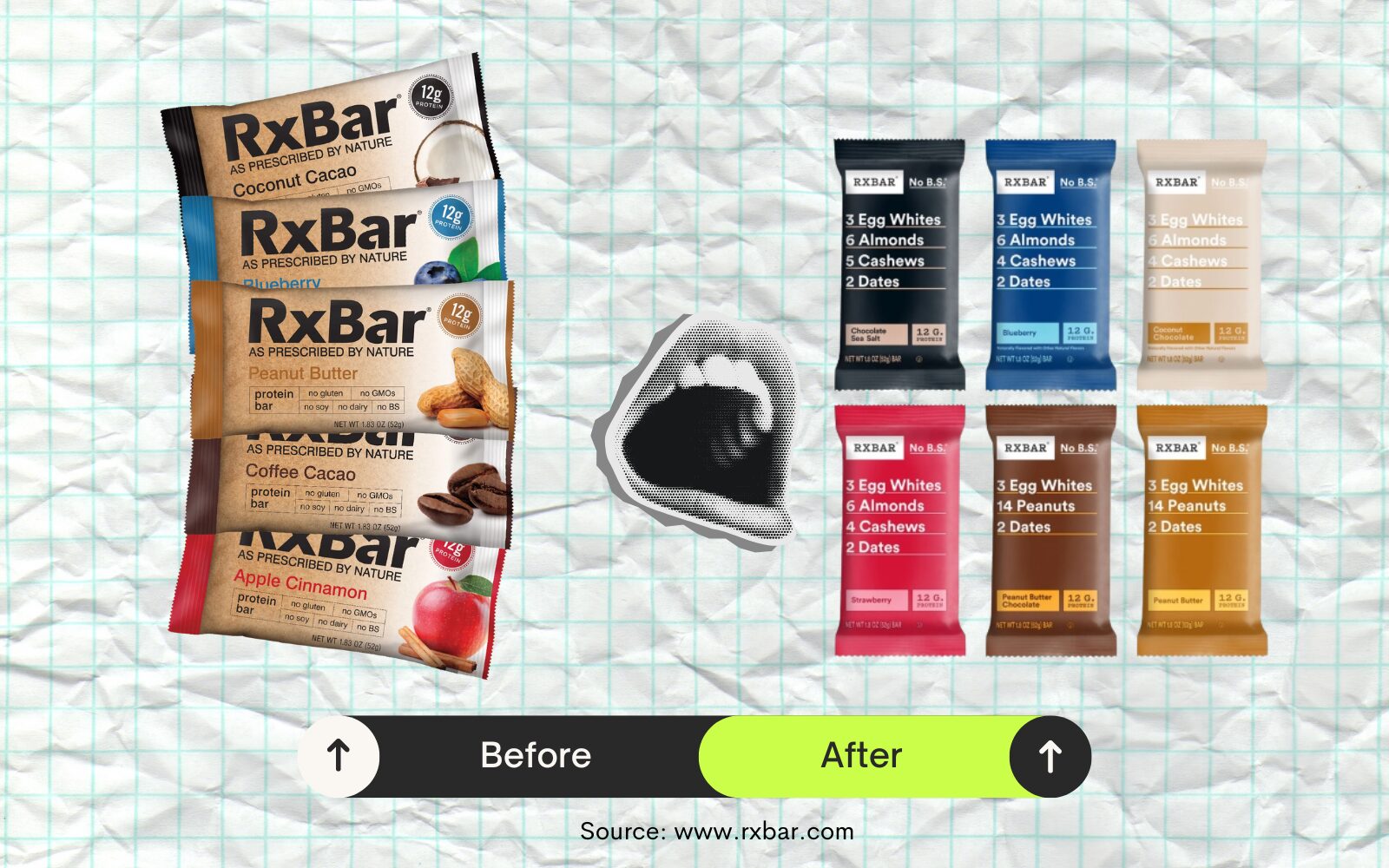
RxBar launched in 2013 with a packaging design that, while functional, lacked the impact needed to stand out in a crowded market. The initial design, created using PowerPoint, was cluttered and failed to convey the brand’s values effectively. This led to difficulties in attracting attention and engaging customers in the highly competitive protein bar segment.
The Redesign: Making Core Ingredients Clear
In 2015, RxBar undertook a major packaging redesign to address these issues. The new design was minimalist, featuring a simple, straightforward listing of core ingredients on the front of the package. This clear and honest approach highlighted the product’s natural ingredients and transparency, setting RxBar apart from competitors that often used more complex and less transparent marketing.
Results: Increase in Brand Visibility and Customer Engagement
The packaging redesign had a profound impact. By 2017, RxBar’s annual sales skyrocketed from $2 million in 2014 to $160 million. The new packaging both improved visibility on crowded shelves and resonated with health-conscious consumers looking for clean, honest food options. The success of this redesign culminated in RxBar being acquired by Kellogg’s for $600 million in 2017.
What Other Brands Can Learn from RxBar’s Success
Simplicity and Transparency
Clear, straightforward packaging that communicates core values and ingredients can significantly enhance consumer trust and product appeal. RxBar’s transparent approach resonated with health-conscious consumers seeking honest and simple products, enhancing trust and boosting appeal. By clearly communicating product contents and values, brands can foster deeper consumer trust and increase product attractiveness.
Market Differentiation
In a saturated market, a different approach to design can effectively differentiate a brand and attract a loyal customer base. RxBar’s packaging overhaul set it apart from other protein bars by eschewing flashy graphics in favor of a clean, ingredient-focused layout. This stark contrast to competitors’ often busy and complex packaging helped RxBar capture consumer attention and stand out on crowded shelves. By differentiating themselves, it became easier for consumers to recognize and choose their products amidst a plethora of options.
Consumer Connection
Packaging that resonates with consumer values can drive substantial sales growth and brand loyalty. RxBar’s commitment to showcasing its clean ingredients directly on the packaging struck a chord with consumers prioritizing natural and healthy options. By aligning packaging with consumer values, brands can foster loyalty and drive long-term growth.
Brand Audit Questionnaire: Is It Time for a Packaging Redesign?
From grabbing attention on a crowded shelf to conveying your brand’s values and benefits, effective packaging is crucial. But when should you redesign your packaging? Use this questionnaire at your next team meeting to help you assess whether it’s time for a new look.
- Is Our Packaging Addressing Consumer Pain Points?
- Are customers experiencing difficulties with the current packaging (e.g., usability issues similar to Heinz’s original glass bottle)?
- Is the packaging convenient and user-friendly?
- Does Our Packaging Clearly Communicate Key Product Features?
- Does the packaging highlight core ingredients and benefits in a clear and straightforward manner (like RxBar’s minimalist design)?
- Are essential details easily visible and understandable at a glance?
- Is Our Packaging Aligned with Current Market Trends?
- Does the packaging reflect current consumer preferences for simplicity, transparency, and honesty?
- Is it designed to meet the needs of your audience (e.g., eco-friendly, health-conscious)?
- Does Our Packaging Stand Out in a Crowded Market?
- Is the design unique and differentiated from competitors, making it easily recognizable on shelves and online?
- Does it have visual appeal that captures consumer attention quickly?
- Is Our Packaging Convenient for Our Target Market?
- Does the packaging cater to the lifestyle of our target audience (e.g., portability and convenience like Justin’s squeeze packs)?
- Are there innovative features that enhance user experience?
- How Is Our Packaging Performing in Customer Feedback?
- Are there consistent complaints or suggestions from customers regarding the packaging?
- What aspects of the packaging do customers frequently praise?
- Is Our Packaging Helping Us Meet Our Sales and Market Share Goals?
- Has there been a noticeable impact on sales performance or market position attributed to the packaging of our competitors?
- Is Our Packaging Consistent with Our Brand Identity?
- Does the packaging reinforce the brand’s core values and mission?
- Is there consistency in design elements that enhance brand recognition?
- Are We Missing Opportunities for Packaging Innovation?
- Are there new packaging technologies or materials that could improve our product’s appeal?
- Have we explored all potential avenues for making the packaging more functional and attractive?
- Is Our Packaging Optimized for E-commerce Platforms like Amazon?
- Does the packaging design translate well into high-quality main images that meet Amazon’s guidelines?
- Are the key features and benefits visible and compelling in online product listings?
If this questionnaire has highlighted areas where your packaging could be improved, it might be time to consider a redesign. By focusing on user experience, market trends, and brand consistency, you can create packaging that stands out and resonates with your target audience.
Interested in gaining more insights from established brands? Check out our interviews with OLLY’s Jennifer Peters and Vivek Rastogi of Colgate-Palmolive.
LET’S DISCOVER WHAT’S POSSIBLE FOR YOUR BRAND
We’re here to listen and uncover opportunities tailored to your unique goals.
Fill out the form to get started, and you’ll walk away with real insights and actionable recommendations—whether we work together or not.
- HANDS-ON LEADERSHIP
- AWARD-WINNING PARTNERSHIPS
- CUSTOM-BUILT SOLUTIONS
